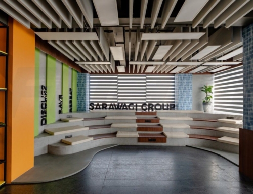
Client name: Mr Kamlesh & Sankesh Mehta
Location: Purasaiwalkam, Chennai
Area: 1000 SQFT
Design Team: FOAID Designs
Date of Completion: June 2024
Design head: Ekta Agarwal
Designs Team: Ar.Parul Agarwal VK, Ar. Firdosh Basha & Arun Kumar
Vasantlal Jewelers is a 100-year-old jewelry showroom initially located above the famous Agarwal Bhavan in Chennai. With time, the showroom changed hands from one generation to another, making each approach different to how each sold their products. Suppose anyone ever visits the Bandra Kurla Complex diamond market. In that case, you can witness large and small commercial offices from which multiple designs and types of jewelry are sold all over the country. This is a very informal yet appointment-based set-up, where the client is invited only by reference into the office, they are shown specific products or are customized as per their taste. There is no display of the jewelry ornaments as such throughout, instead an office setup with multiple rooms for different sets of clients as meeting rooms.
The client was very clear on the brief from day 1, that they did not want any display but a room concept with a proper office setup, where the clients would come via a waiting area and then be bifurcated to private rooms/ zones for the purchases. They wanted a very clean, sober, and sophisticated setup. Minimal is design but completely functional keeping their needs for the setup in mind. Another thing was the timeline, which we had to stick to bringing about the space within 45 days, including factory products so ease of mobility, and keep in mind the budget for the project as stipulated by the client.
The design process was easy and smooth, as we understood the client’s needs and translated them into custom-made furniture. The main areas were the reception, MD cabins 1 & 2 along with the main Display cabin. From a designer’s point of view, we envisioned the reception area to be a very dramatic and grand one that will culminate in multiple rooms. This was the central space that tied all the rooms together and also a space where the client would spend some time and judge the brand before making final decisions.
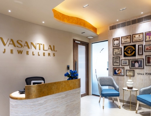
The reception area has a history wall cladded with photographs that the client has collected over the years, which depicts the history of the company. The room being compact is completely covered in a single textured finish making it sober and monotone from an Asian paints new series of paints. There is a curved wall that is used to separate the Display room and the reception area to accommodate space for the receptionist. There is a large cut or opening in the false ceiling which was thoughtfully curated as the structure had this large beam right in the center of the room. Therefore we used it to our advantage in both the spaces and played around with the heights of the room for that drama that we needed.
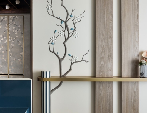
From the reception we moved to the MD cabin on one side, which was a simple room with the highlight created only on the back, with again a new material from Dorbi laminates. A material that looks and feels a lot like marble or stone laminate but is a premium laminate instead. The shelf near the window was created as an element of highlight too. The client was clear that this was the room with maximum ventilation and to keep it intact. Therefore the orientation and design followed the same. The table was a custom-designed one, curating each of the needs stipulated by the client, making it very user-friendly and as per their taste and thoughts.
As a jewelry office design, the security and access controls were of utmost importance, as at any point in time, the jewelry has to be secure. There were a lot of permutations and combinations that we tried to master, all access to be secured and access to be given to only specific personnel. As we worked on the complete Vastu of the space, the layout went through multiple civil changes to correct this exhibition space.
The display room has a large oval custom-made display table which allows the showcase of the products and also allows complete billing and purchases via the same. It was curated to understand the procedure of how the business works and then developed as a product so unique to this space and the users. A space was made for the trolley that is used to move around the jewels which can be hidden and stacked carefully below the table itself. There was also a large round mirror with a lounge provided to give the customer a complete look. This was derived from multiple visits to the showroom, where there is a lack of large mirrors to check and purchase. As designers, we felt that when customers are investing this much into the products then it is important they can get the complete feeling of the jewels they adorn on themselves. Also creates a new experience for the customers, adopted from the changing room concept.
The MD cabin was to be delivered as a simple room, which has direct access to the safe or the strong room. The table was also designed as custom-made for the MD so that he does not have trouble selling the products. Inspired by the V from VJ we tried to incorporate the brand name through the furniture and the units so that it would engage the customers too.
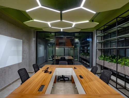
We also incorporated the pantry, office room, and a multi-use studio that can be used as a space for brand shoots and even a discussion space when required. The office room was a simple one to seat 6 back-end staff and had a completely different entry and exit so that it did not hinder the meeting activities throughout the day.
While visiting the famous BKC, it was surprising to see the concept of an office as an experience center. We are now proud and very delighted that Chennai is also shifting into this concept of display, which makes it a more customized curated experience for the customers.


