OUR PROJECTS
Project Description
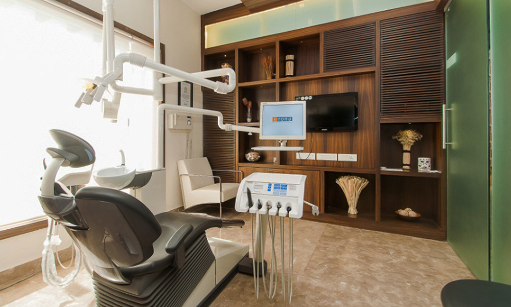
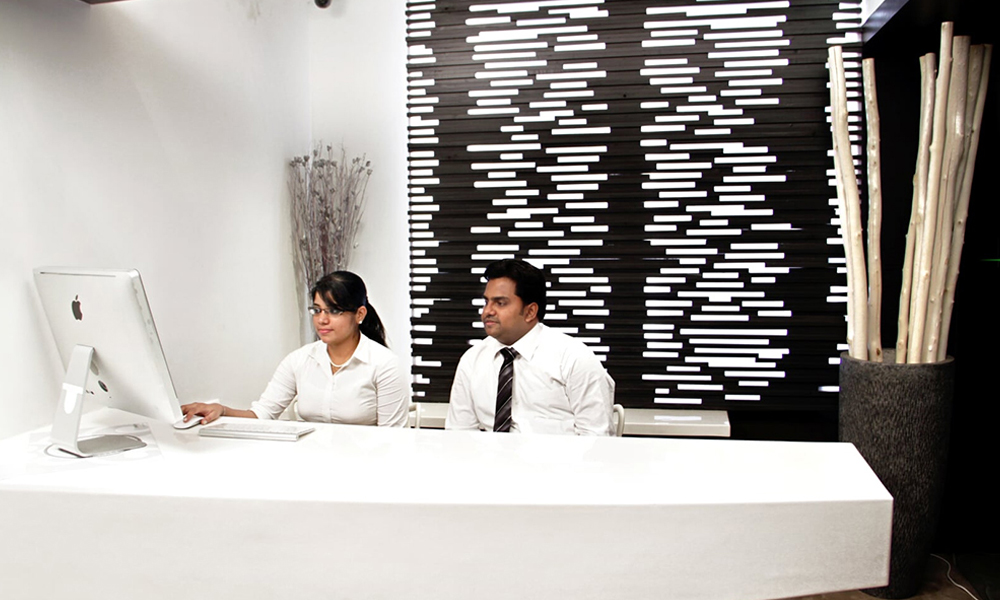
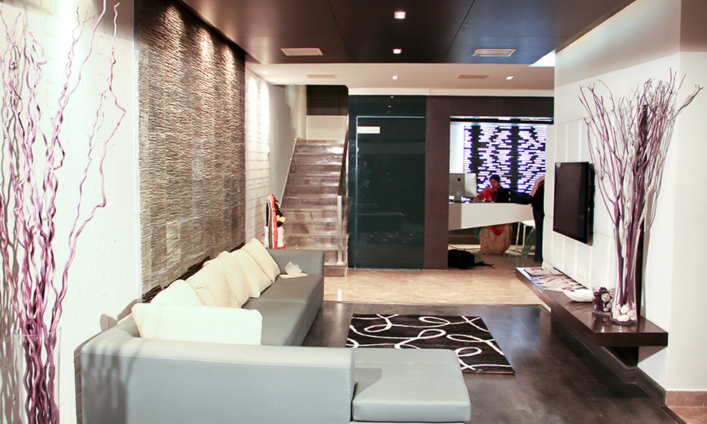
One of the first projects of FOAID Design Studio, located at the very center of Chennai’s urban fabric, Khader Nawaz Khan Road. The site underwent renovations followed by the interiors of the area. We defined the dental spa with modern aesthetics that has garnered attention for its premium service over the years. The color palettes were hand-picked to suit the function of each room. This way we were able to make the function more appealing and coexistent with the interiors of the space.
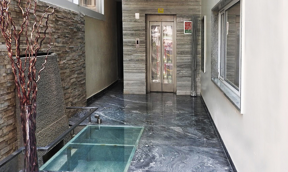
The major feature of the project was the transition space which was illuminated by the introduction of a glass bridge which was the latest trend at that moment.
Location: Khader Nawaz Khan Road, Chennai
Client: Apollo Hospitals
Site area: 12,000 sq. ft
Design Team: Ekta Agarwal, Suny Akber, Arun Kumar, Mukesh Chouhan, Mohammad Unaise, Lakshita
Year of Completion: 2011
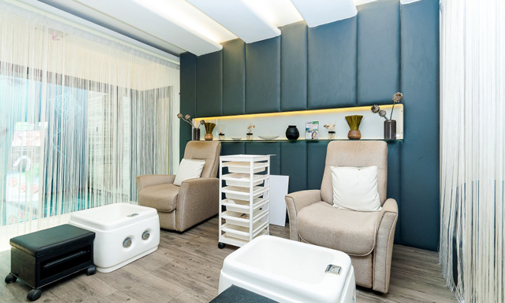
As for the rooms, the foot spa lounge was backed with teal upholstered panels matched with a light-colored wood to give the user a feeling of tranquility.
The VIP Examination room speaks sophistication. One of the walls shows off with a composition of storage and shelves with premium quality wood while the others are kept subtle so as to not deter one’s focus.
This project received the Best Clinic Interiors Award for the year 2016, which followed many more associations with Apollo Hospitals.
Project Description
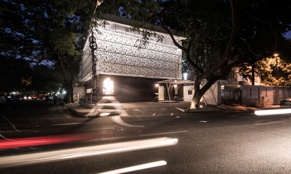
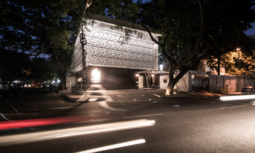
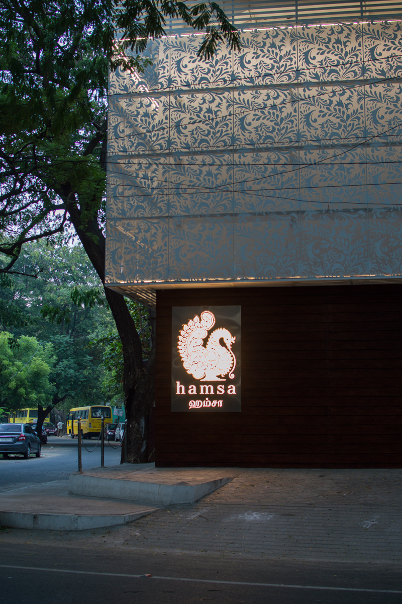
The FOAID Design Studio team collaborated with Sajid and Vivek Architects for the exteriors to create a symbolic structure on the busy roads of Adyar. The exterior is cladded with perforated metal panels with natural patterns and the entrance is marked by a free standing metal structure.
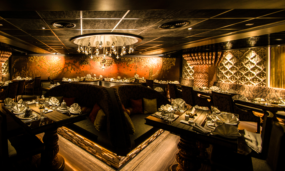
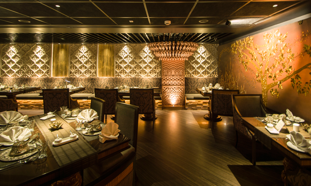
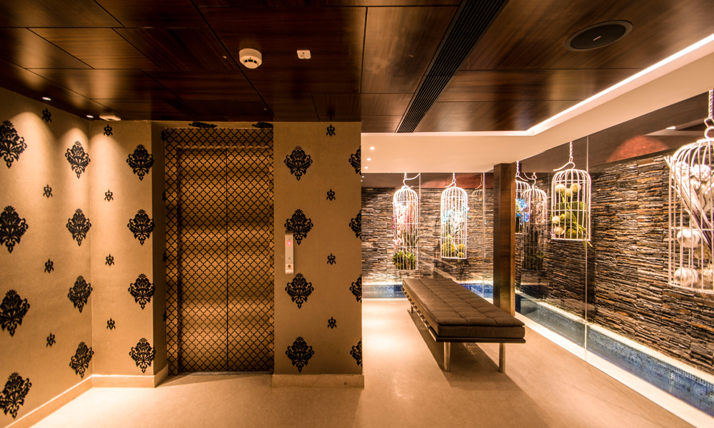
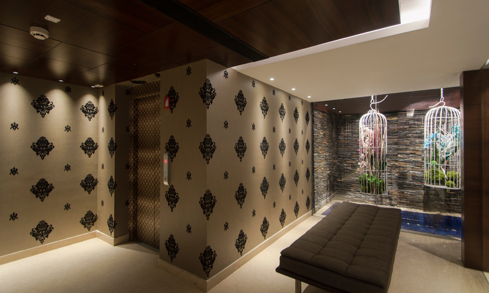
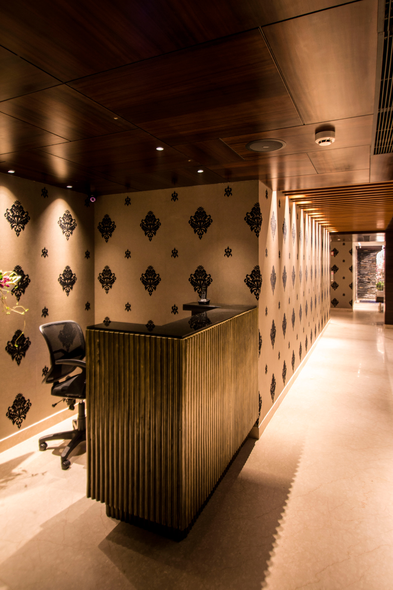
As the name stands, the concept of the restaurant was based on the swan. From the floor to the ceiling, every detail has been intricately curated by the team with full support and guidance from our client Mr. Kalkiraju’s requirements. The project is a fine blend between traditional architecture and bespoke interiors.
Location: Adyar, Chennai
Client: Mr. Nithin Kalkiraju
Site area: 10,000 sq. ft
Design Team: Ekta Agarwal, Suny Akber, Ananthi Selvi, Mukesh Chouhan, Rehan
Year of Completion: 2016
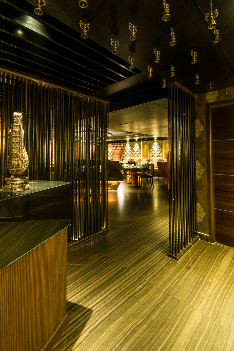
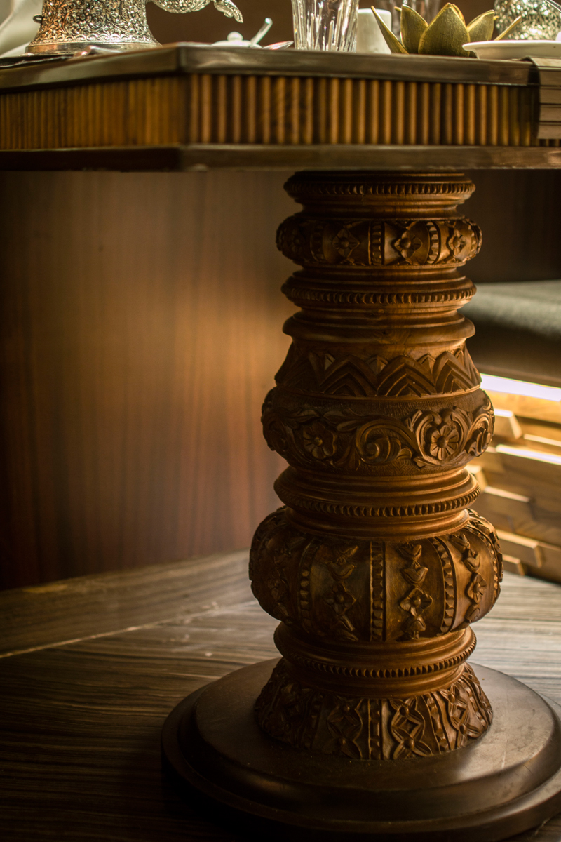
Inspired by the traditional columns, these are replicated as the base for the dining tables at the restaurant in the form of a mass chunk of sculpted wood. Elements like the bronze lanterns depict marvelous chandeliers at the center of the restaurant. They are displayed both at the Center and the entry to the restaurant. The teams made sure to explore all possible solutions with stone work and collaborated with local craftsmen, giving the restaurant an authentic and rich appearance.
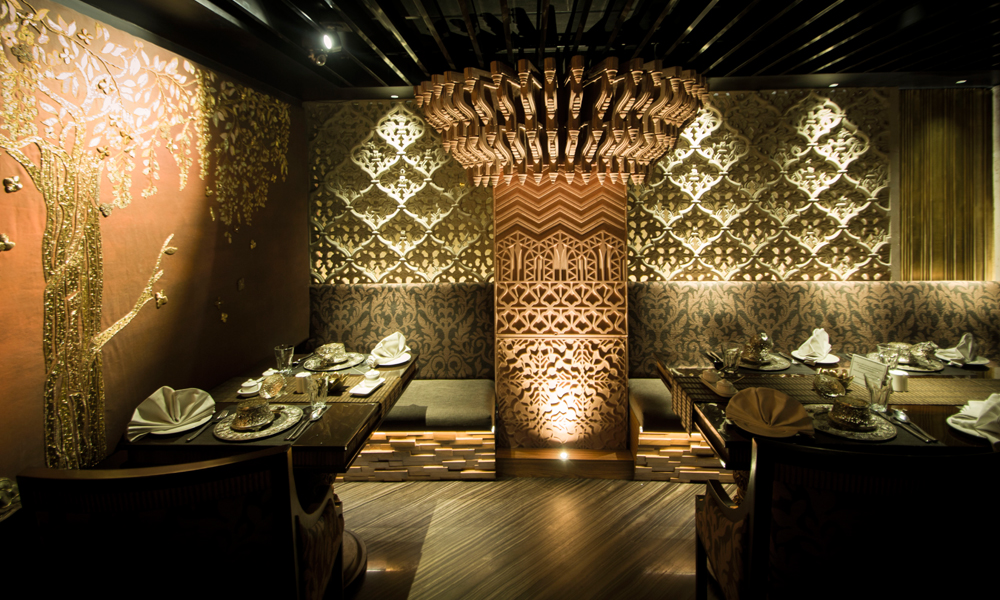
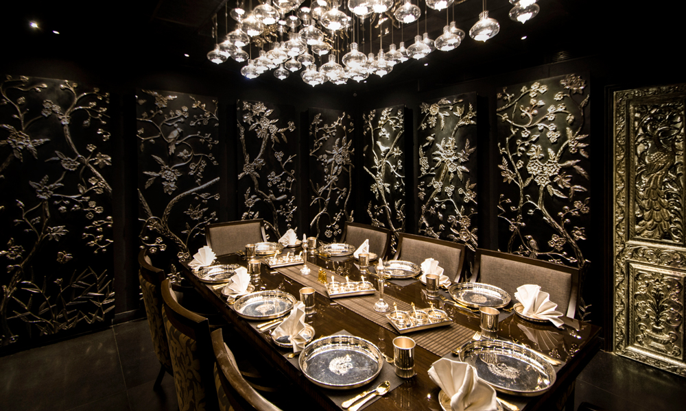
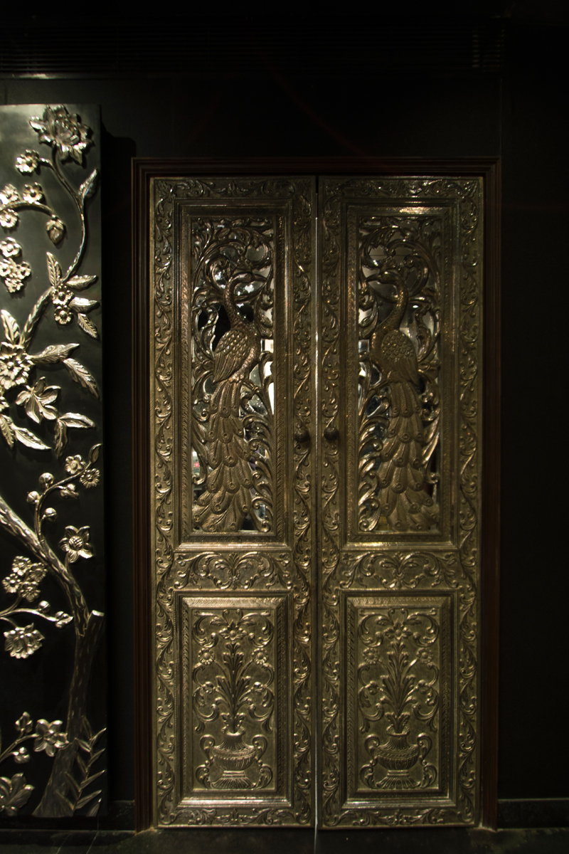
The Private Dining Room at Hamsa was atmospherically distinct, a unique dining area infused with rich colors – dark tones of Gray and Silver. Silver was another such exquisite metal used through the interiors, specifically in the PDR. Inspired from nature, flora and fauna patterns were designed and carved by Rajasthan craftsmen. The detail of ornate floral and leaf patterns intricately carved on wood and then coated with silver is a wonder to every eye.
Hamsa is a high end, luxury dining restaurant that showcases a mélange of culture and curries. It is a sure visit to witness the finely curated details that make it standout from any other fine dining restaurants in the city.
Project Description
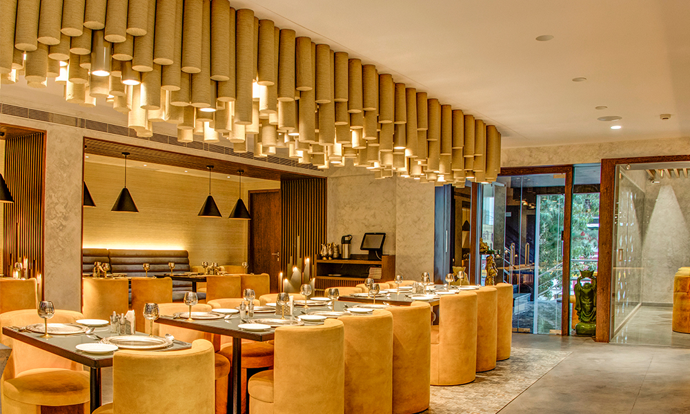
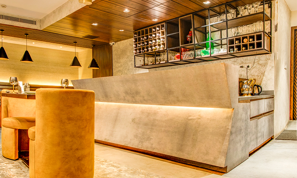
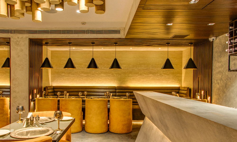
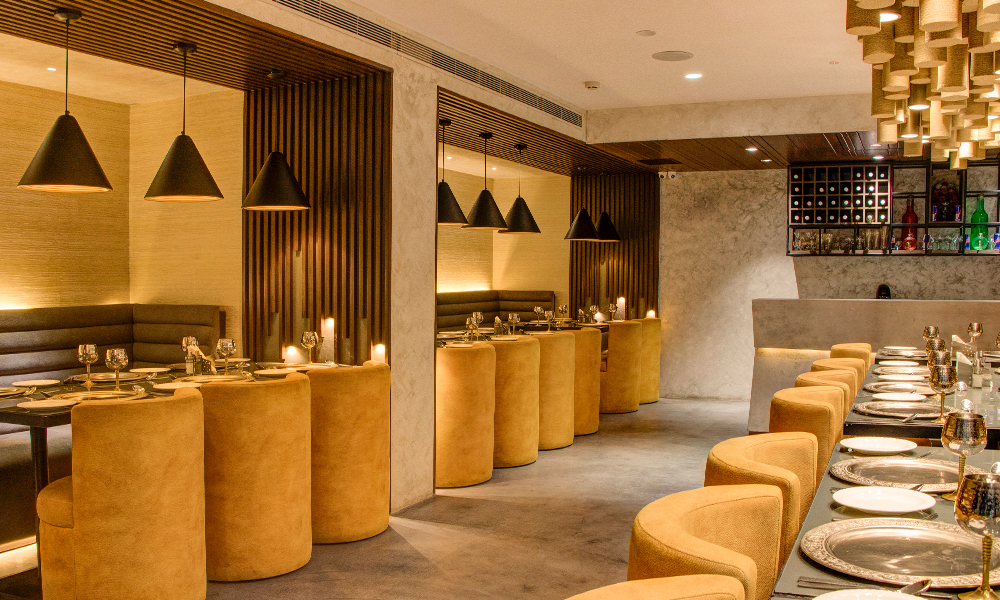
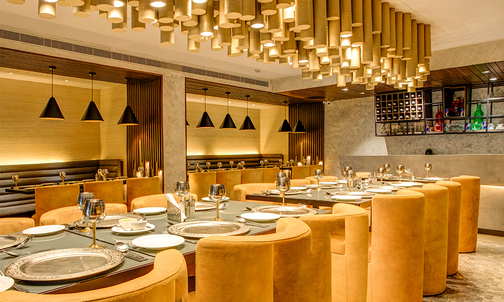
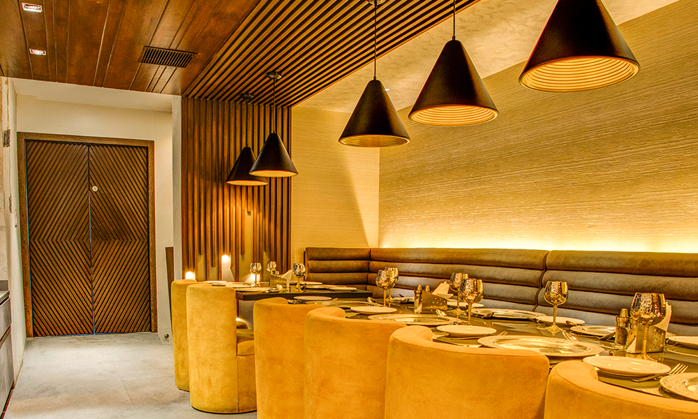
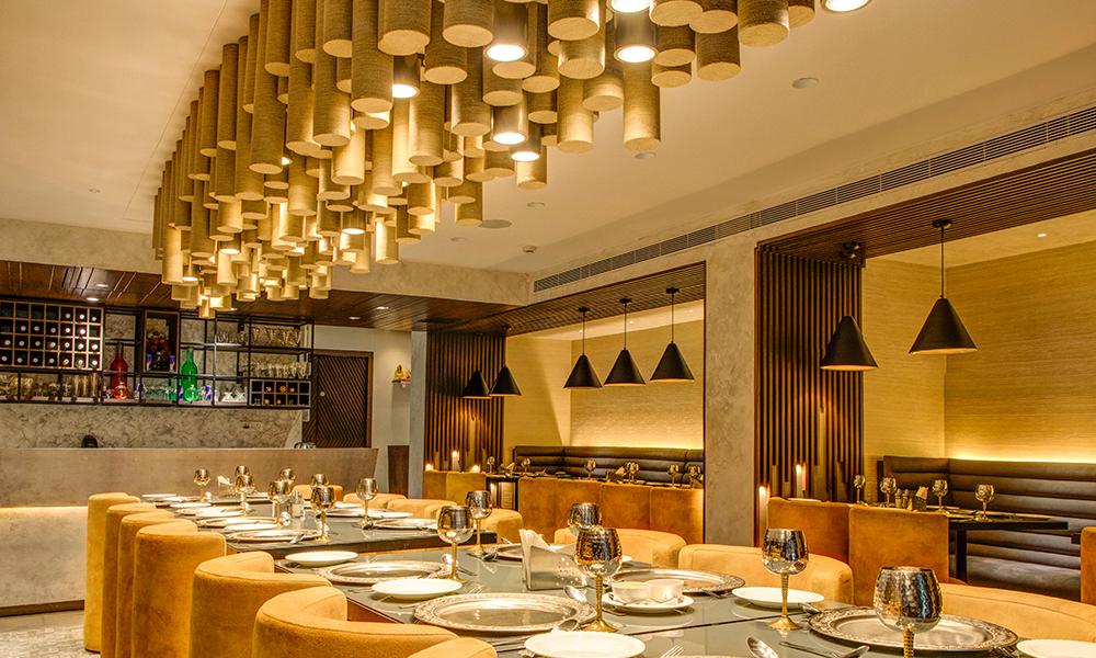
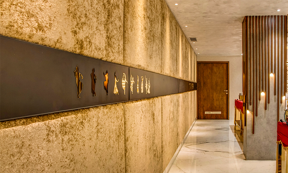
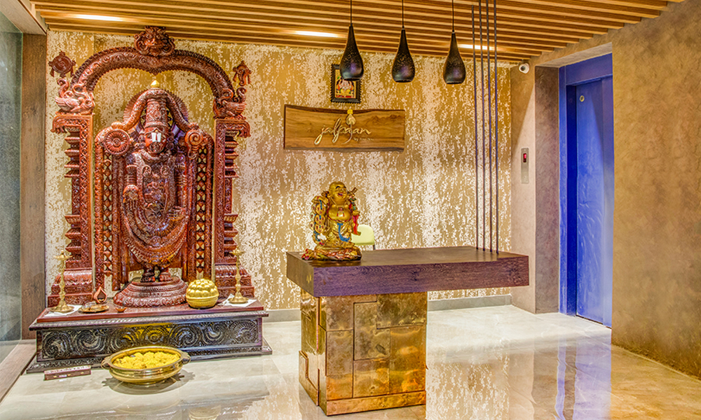
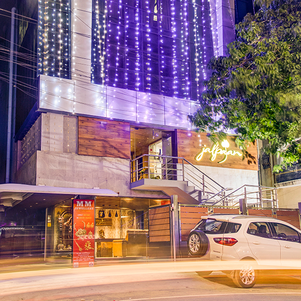
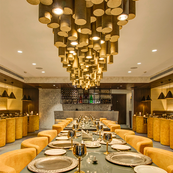
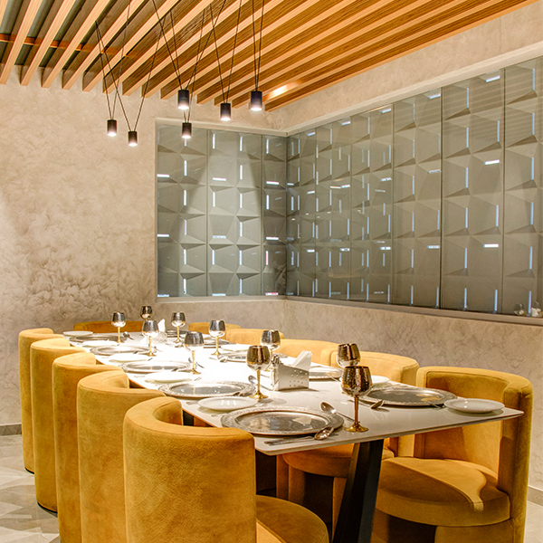
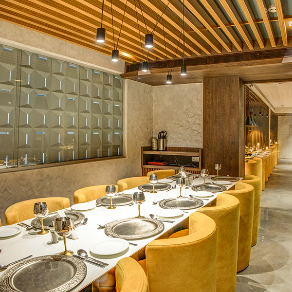
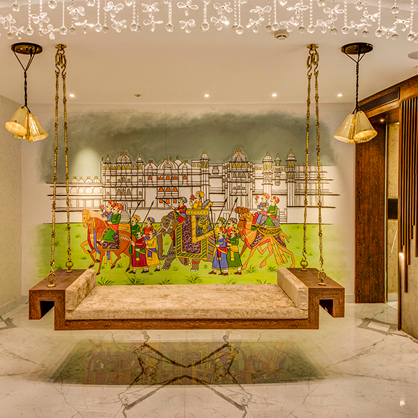
Jalpaan is a restaurant that seeks to raise the bar for authentic Indian cuisine eateries. The concept was to convey with the interior, the fresh and traditional essence that the menu was going to offer. We have reflected our ideas in the spaces through light and materials that have been chosen after several trial and error methods.
Ecclectism-Fusion of contemporary styles with classical accessories is the look we have given for Jalpaan.
Location: Saligramam, Chennai
Client: Mr. Ashok Taleda, Mr. Naveen Ostwal, Mr.Pawan Mehta and Mr. Balwanth Nahata
Site area: 5500 sq. ft
Design Team: Ekta Agarwal, Mukesh Chouhan, Arun Kumar & Parul Agarwal
Year of Completion: 2018
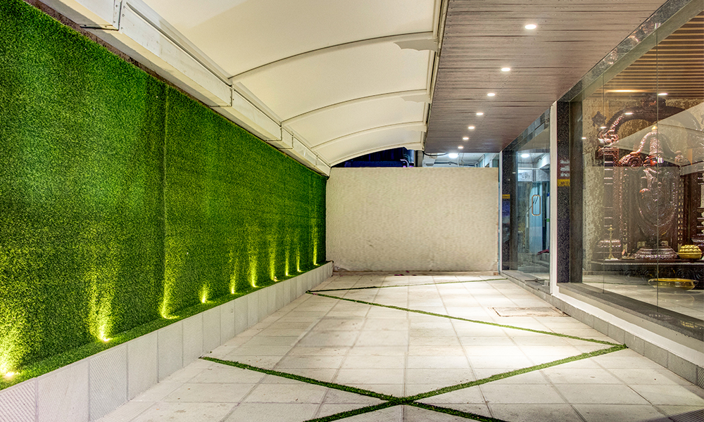
On the ground floor, the reception features a rustic look while the chaat area is highlighted with its bareness. This semi open space gives the user an experience of popping a pani puri in the original manner, where each one has been handmade to please their taste buds. The rest of the three storied structure houses the restaurant on the first floor and the banquet hall on the second floor.
The restaurant is illuminated with a varied range of lighting fixtures that have been specially curated and prototyped to blend with its surroundings at the same time act as an element of sculpture.
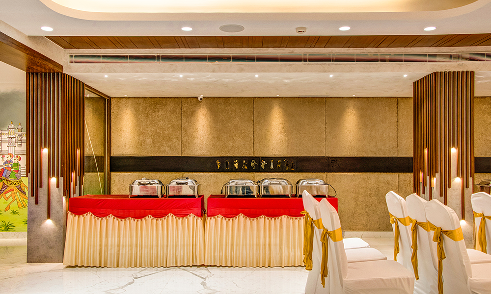
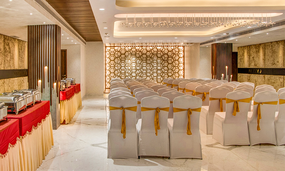
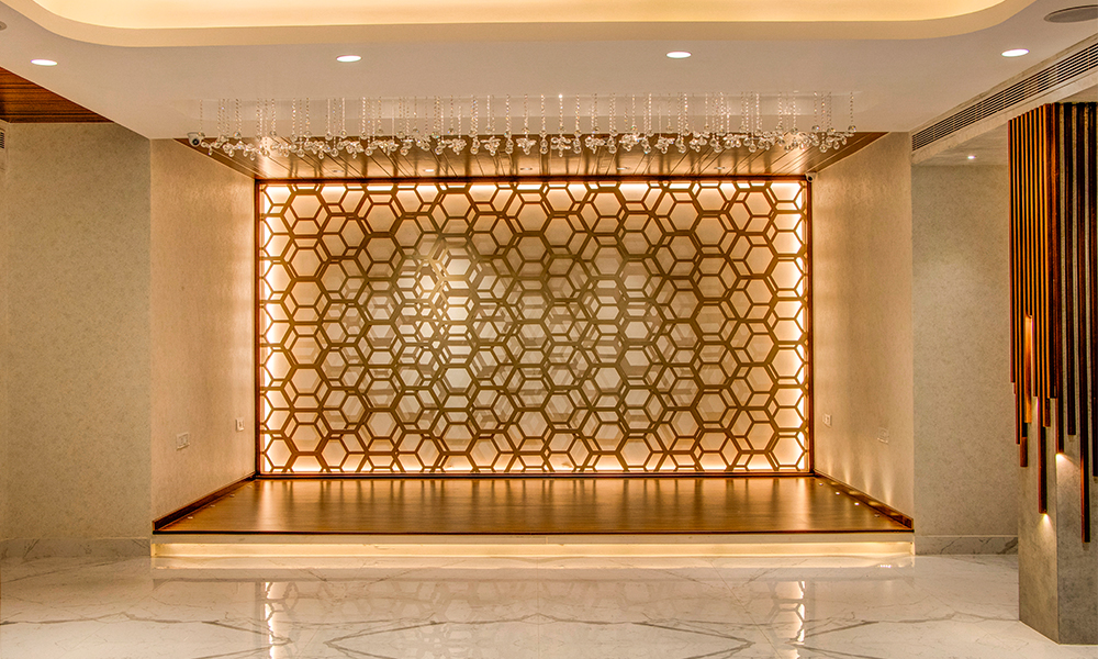
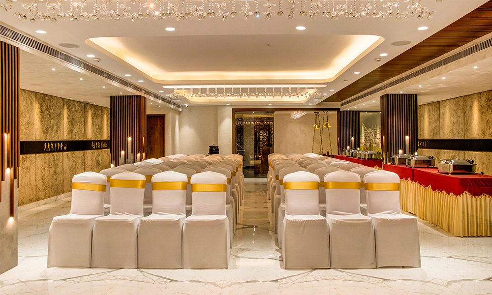
The design of the banquet hall is finished with a sleek look incorporating wall panels with Indian classical dance movements sticking to the rhythm of the concept.
Project Description
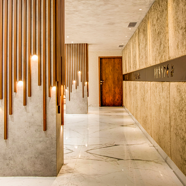
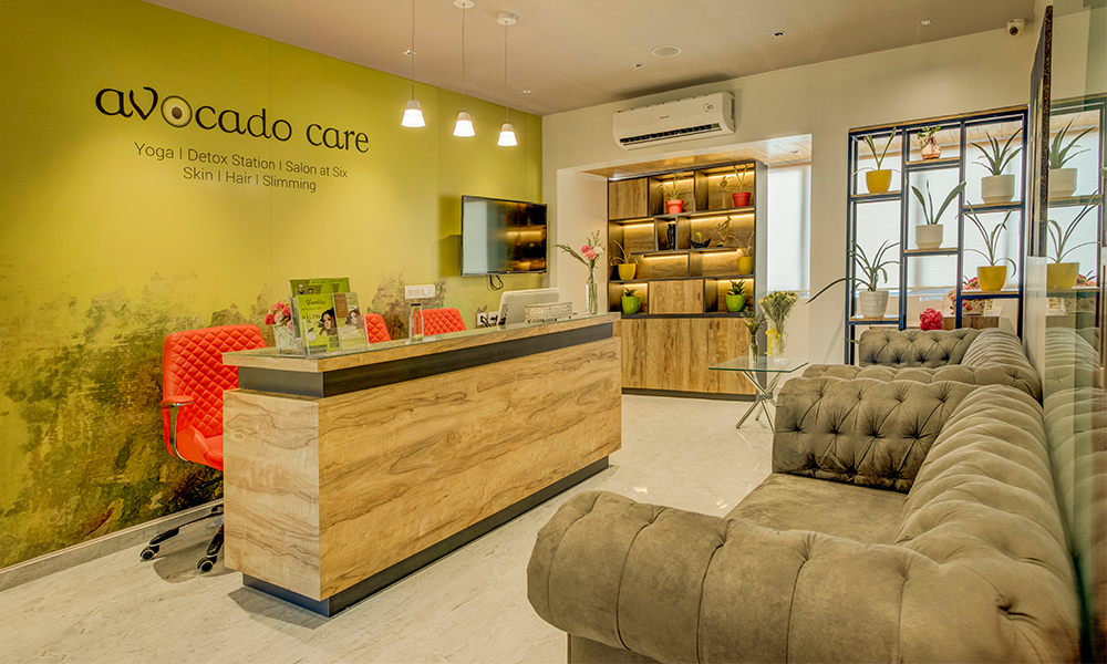
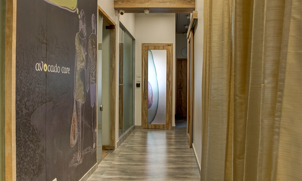
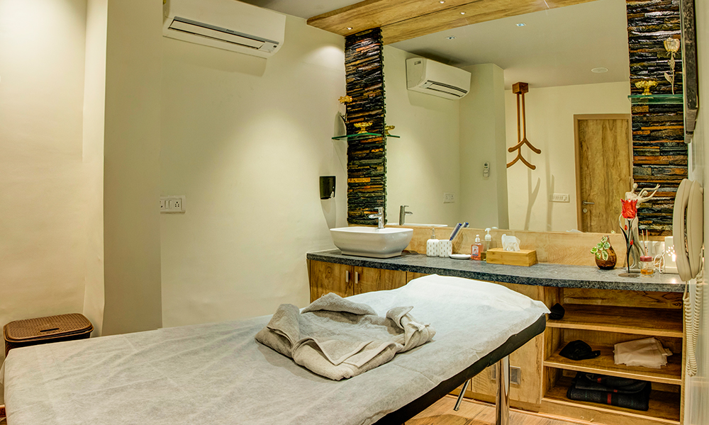
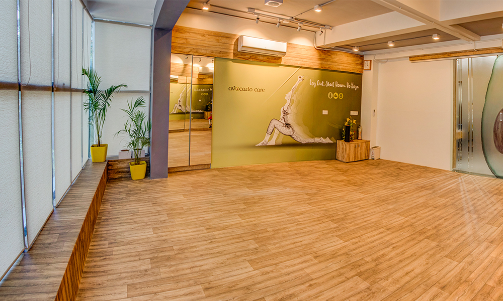
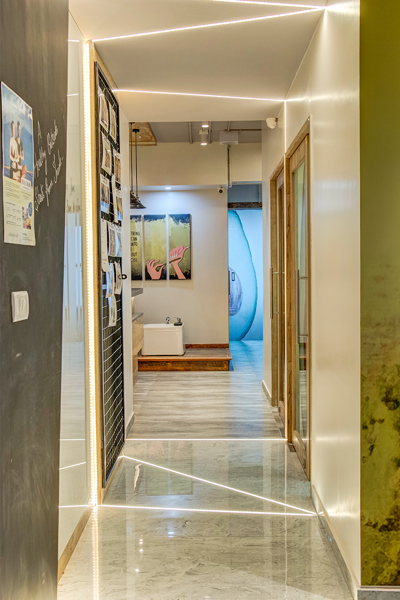
This project’s concept was to fuse the fresh and vibrant natural surroundings into the interiors of the spa. The client wanted to create a peaceful yet energetic space. So the inspiration came from the name itself. A raw and rustic atmosphere created by carefully selected materials and color scheme enhanced the natural ambiance of the space.
Location: T. Nagar, Chennai
Client: Mrs. & Mr. Rajnish Kalani
Site area: 10,500 sqft
Design Team: EktaAgarwal, Ananthi and Charitaa Bagry
Year of Completion: 2018
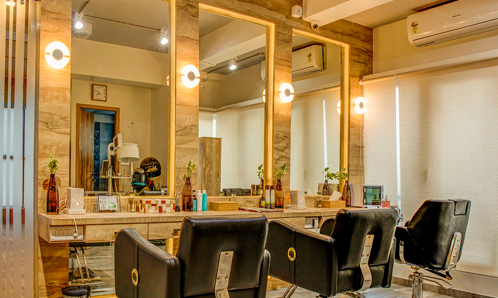
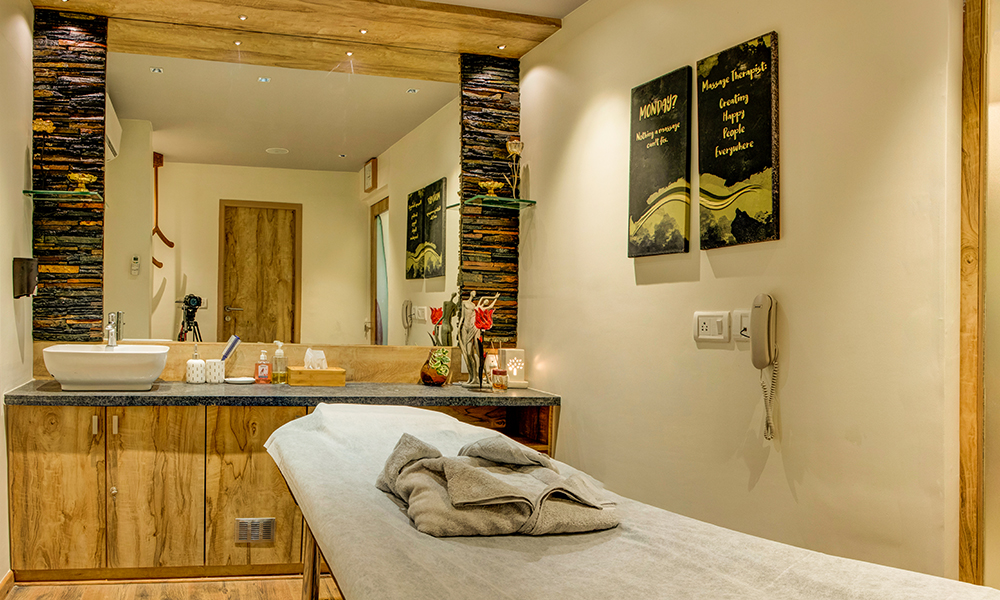
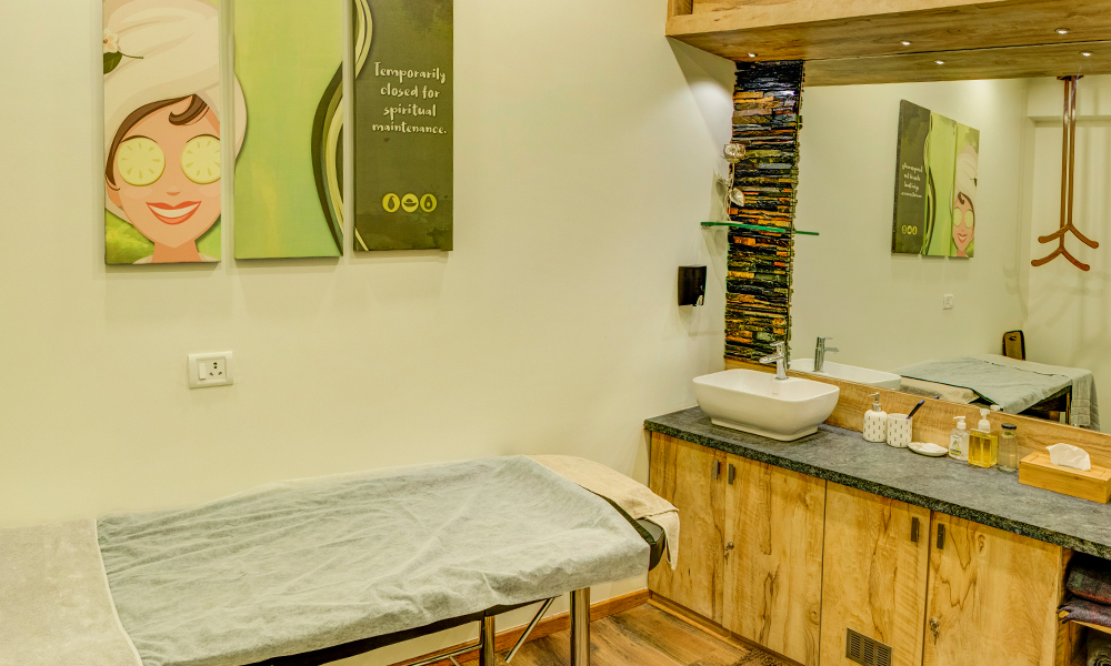
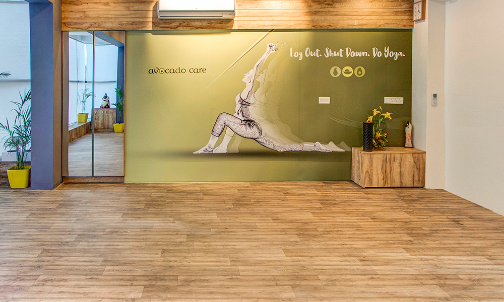
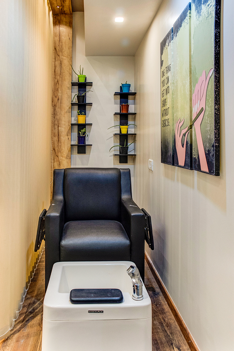
The spa caters to various needs and so the space had to be designed to accommodate all the client’s requirements. Designated areas for skin and hair treatment, hair salon, massage rooms, yoga hall, steam room along with more private areas such as the MD cabin, pantry, and doctor’s clinic were designed.
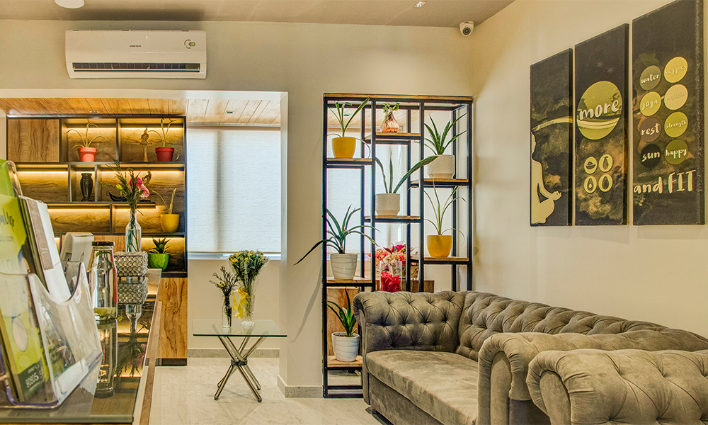
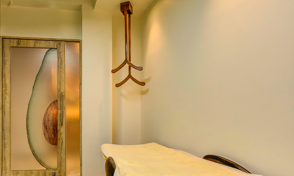
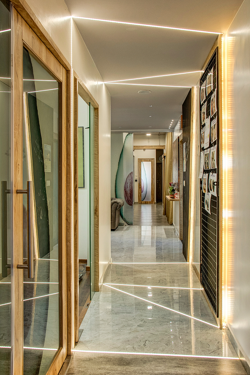
The furniture’s were mostly customized according to the space. Built-in storage into feature walls helped save space in the massage rooms. Customized hangers were designed to drop from the ceiling to further reduce the clutter. The reception features two custom-made display units to highlight the space. The entrance walkway includes an LED floor to wall to ceiling lighting feature that acts as a focal point of the space.
Overall the concept of a dynamic yet calming space was achieved by using various design elements and materials.
Product Description
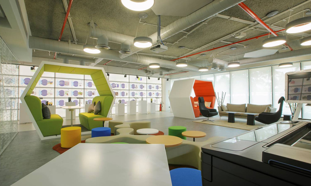
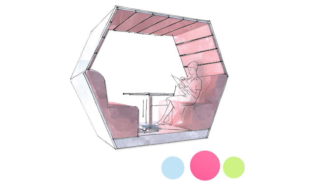
Noise is the biggest problem in offices. More so in an open office layout, sounds travel faster as there are no barriers that generally help in the process of absorption. The Hexapods are framed pods made from thick upholstery to manage the noise level and comfort within it.
Project: Renault Nissan – Innovation Lab
Year: 2017
Designer: Parul Agarwal
Status: Completed
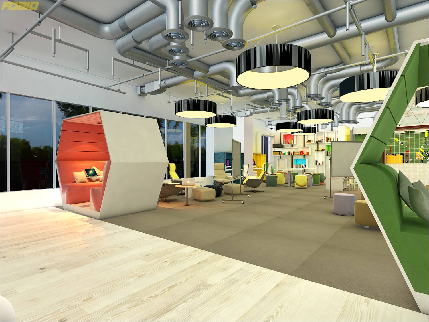
The interiors of the pod are of funky colors like fuchsia pink, blue and lime green to break the monotony of general office interiors. The pods hold good for semi-private discussions and also act as cubicles that have been designed with a different geometrical approach.
The shape was derived keeping in mind the anthropology of the human sitting posture.
Project Description
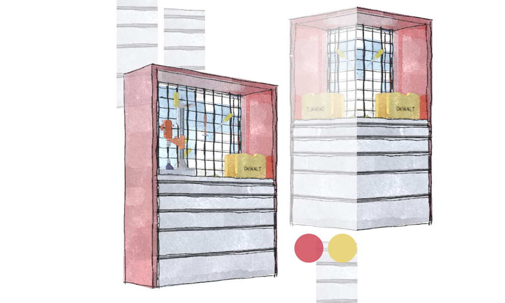
The concept of breaking the stereotypical store room and accessorizing the tools brought about our customized Tool Box!
Project: Renault Nissan – Innovation Lab
Year: 2017
Designer: Parul Agarwal
Status: Completed
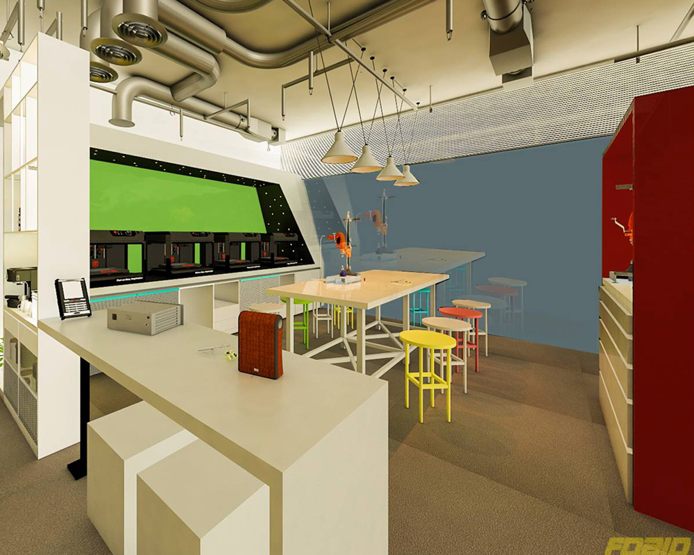
This box is designed with grills to accommodate magnets that hold the tools in position. While the shelves below the work table are tailor-made to function as individual tool kits. This unit can be placed in any space to act as an oversized tool or storage unit.
Product Description
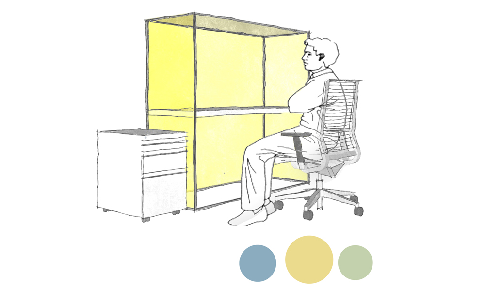
Going with the cubicle, we created a workspace where the user could have their personal space for a heads’ down project, but also want to be able to collaborate with their colleagues conveniently and comfortably.
Project: Renault Nissan – Innovation Lab
Year: 2017
Designer: Parul Agarwal
Status: Completed
This compact piece of furniture shows off with its quirky colors, is easy to maintain and move because of its light-weight. The primary materials used are glass and wood, make it not just easy to move around the space but also visually light. Therefore, within this cubical one feels isolated to focus on individual work but still in contact with their co-workers for assistance or guidance.
Product Description
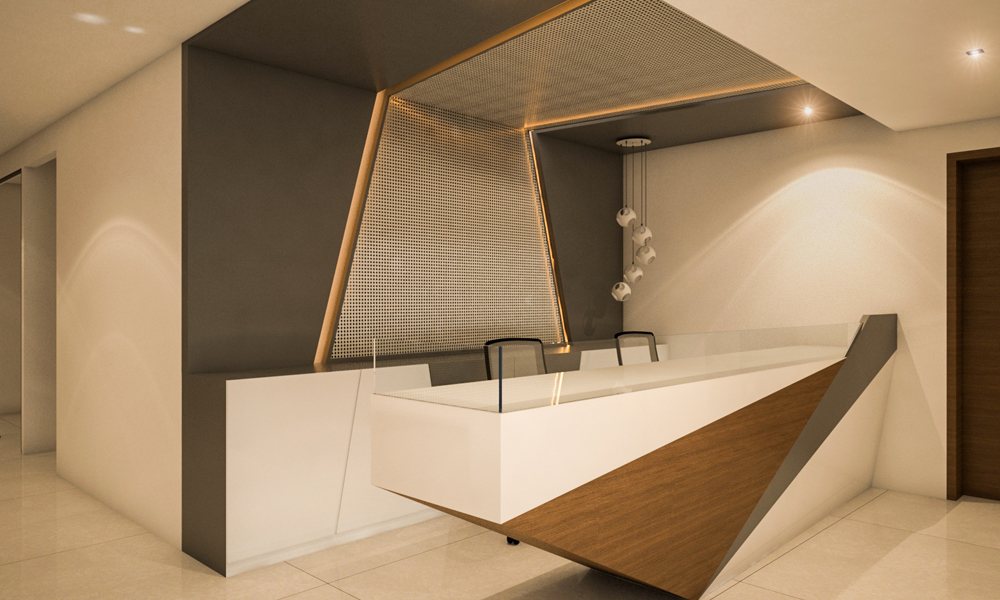
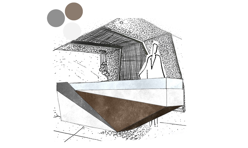
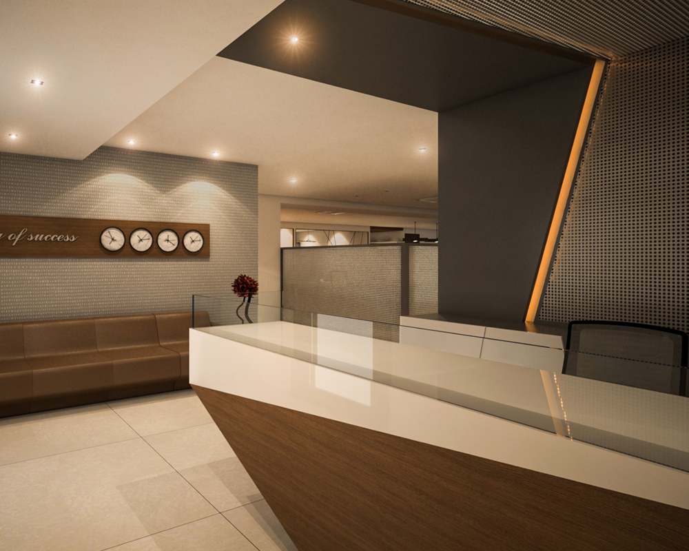
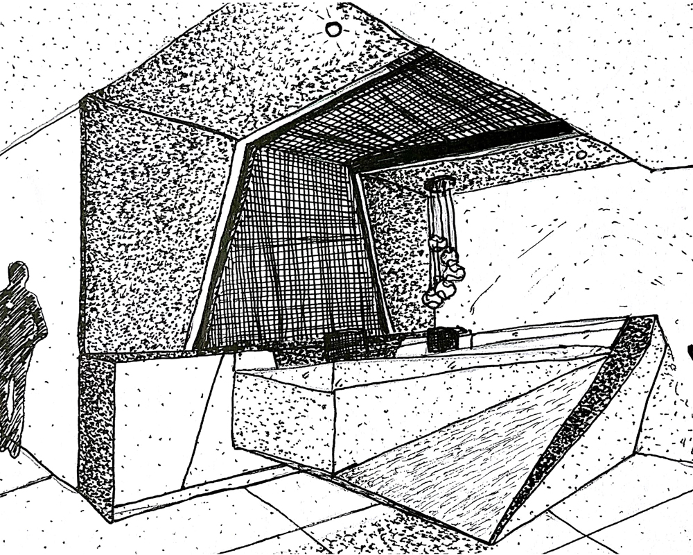
A reception table is considered to be the first impression to a client’s mind before they enter a commercial space. This table had been designed to give the perception of a yacht, acting as a stand out piece at the entrance of the reception area. The sharp lines of the table give it a definition making the personal and public boundaries clear.
Project: South India Papers Pvt.Ltd
Year: 2017
Designer: Mukesh Chouhan
Status: Ongoing
Product Description
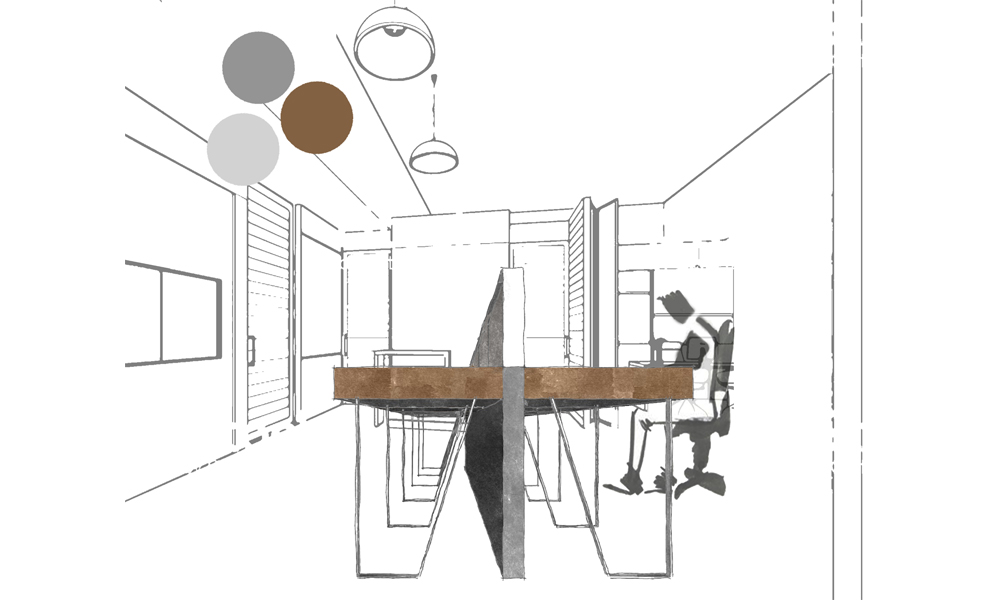
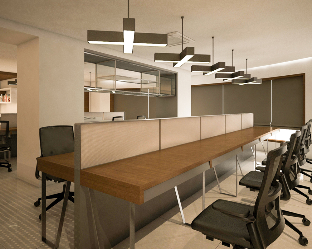
Perfect for group work, allowing each person their own private unit. Going in line with the rest of the interiors, the unit was inspired by the exo-skeletal structure of the main sail of a yacht.
Project: South India Papers Pvt.Ltd
Year: 2017
Designer: Mukesh Chouhan
Status: Ongoing
Product Description
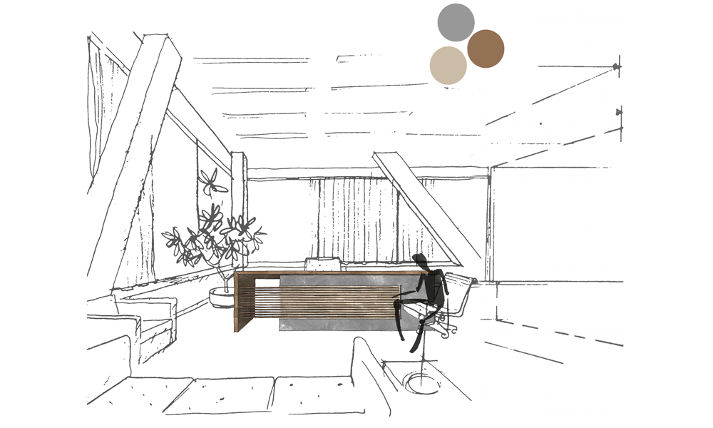
While designing an individual cabin table, we keep in mind the privacy of the user, while making the users welcome their visitors with utmost dignity. Most clients prefer a personal table that has a visual barrier between them and the visitor. This table does justify to this point by allowing the design by itself to serve the purpose.
Project: South India Papers Pvt.Ltd
Year: 2017
Designer: Mukesh Chouhan
Status: Ongoing
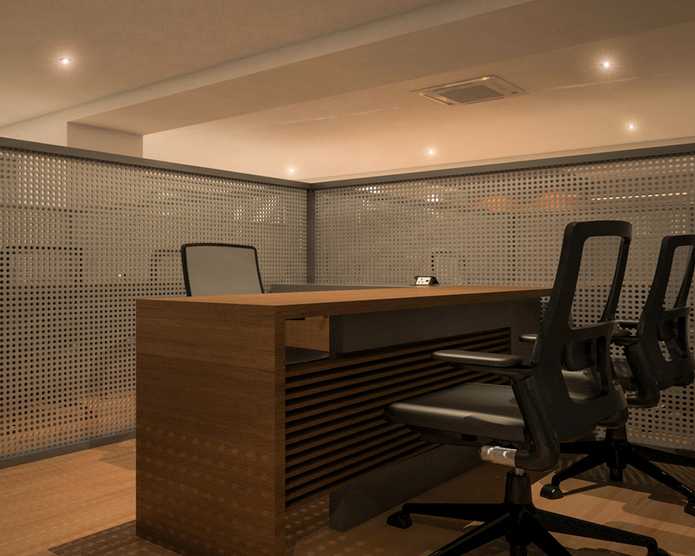
This table uses a combination of concrete and wooded finishes to provide a modern feel to it. The table has been designed and inspired by the dual material palette and clean combinations of a yacht, going in sync with rest of the commercial office interior design.
Product Description
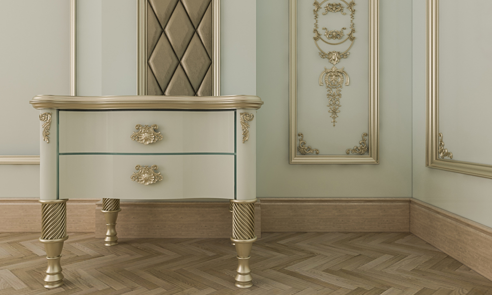
This table has been designed keeping in mind the client as well the space in which it to be placed. It is defined as a combination of Victorian style fused with Indian elements.
Project: Geetanjali Residence
Year: 2017
Designer: Mukesh Chouhan
Status: Ongoing
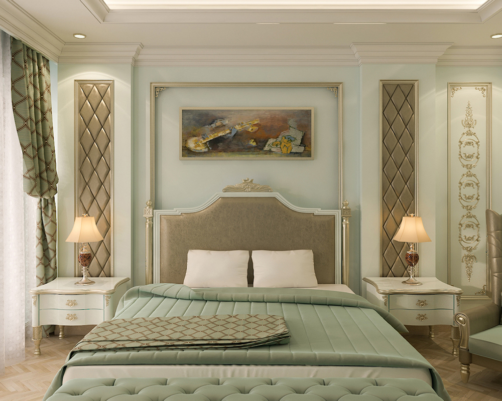
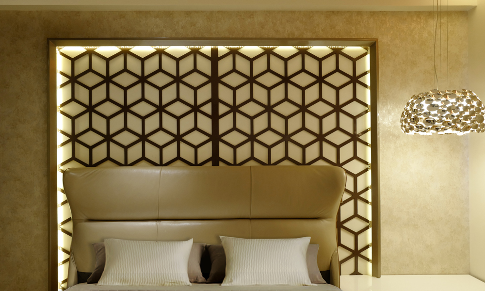
As the name suggests, this table is located in the master bedroom of the home, making it ideal to follow a grand palatial appearance. The table uses color combinations inspired by the Victorian style to merge with the flooring and panels of the room. On the contrary the details of the table follow the Indian classical floral and carved elements.
Rani Victoria is easy to modify in terms of ratio, while it can be placed anywhere within your house to give it a classical touch.
Residential
Commercial
Hospitality
Landscape
Global Leathers Pvt.Ltd
By Foaid|2023-11-30T10:43:28+00:00April 27th, 2018|Categories: Project, Industrial|
Brilliant Alloy Pvt.Ltd
By Foaid|2023-11-30T10:44:30+00:00June 15th, 2018|Categories: Project, Industrial|
Product

Product Description
Noise is the biggest problem in offices. More so in an open office layout, sounds travel faster as there are no barriers that generally help in the process of absorption. The Hexapods are framed pods made from thick upholstery to manage the noise level and comfort within it.
Project: Renault Nissan – Innovation Lab
Year: 2017
Designer: Parul Agarwal
Status: Completed

The interiors of the pod are of funky colors like fuchsia pink, blue and lime green to break the monotony of general office interiors. The pods hold good for semi-private discussions and also act as cubicles that have been designed with a different geometrical approach.
The shape was derived keeping in mind the anthropology of the human sitting posture.

Project Description
The concept of breaking the stereotypical store room and accessorizing the tools brought about our customized Tool Box!
Project: Renault Nissan – Innovation Lab
Year: 2017
Designer: Parul Agarwal
Status: Completed

This box is designed with grills to accommodate magnets that hold the tools in position. While the shelves below the work table are tailor-made to function as individual tool kits. This unit can be placed in any space to act as an oversized tool or storage unit.

Product Description
Going with the cubicle, we created a workspace where the user could have their personal space for a heads’ down project, but also want to be able to collaborate with their colleagues conveniently and comfortably.
Project: Renault Nissan – Innovation Lab
Year: 2017
Designer: Parul Agarwal
Status: Completed
This compact piece of furniture shows off with its quirky colors, is easy to maintain and move because of its light-weight. The primary materials used are glass and wood, make it not just easy to move around the space but also visually light. Therefore, within this cubical one feels isolated to focus on individual work but still in contact with their co-workers for assistance or guidance.

Product Description
A reception table is considered to be the first impression to a client’s mind before they enter a commercial space. This table had been designed to give the perception of a yacht, acting as a stand out piece at the entrance of the reception area. The sharp lines of the table give it a definition making the personal and public boundaries clear.
Project: South India Papers Pvt.Ltd
Year: 2017
Designer: Mukesh Chouhan
Status: Ongoing


Product Description
Perfect for group work, allowing each person their own private unit. Going in line with the rest of the interiors, the unit was inspired by the exo-skeletal structure of the main sail of a yacht.
Project: South India Papers Pvt.Ltd
Year: 2017
Designer: Mukesh Chouhan
Status: Ongoing


Product Description
While designing an individual cabin table, we keep in mind the privacy of the user, while making the users welcome their visitors with utmost dignity. Most clients prefer a personal table that has a visual barrier between them and the visitor. This table does justify to this point by allowing the design by itself to serve the purpose.
Project: South India Papers Pvt.Ltd
Year: 2017
Designer: Mukesh Chouhan
Status: Ongoing

This table uses a combination of concrete and wooded finishes to provide a modern feel to it. The table has been designed and inspired by the dual material palette and clean combinations of a yacht, going in sync with rest of the commercial office interior design.
Urban
Global Leathers Pvt.Ltd
By Foaid|2023-11-30T10:43:28+00:00April 27th, 2018|Categories: Project, Industrial|
Brilliant Alloy Pvt.Ltd
By Foaid|2023-11-30T10:44:30+00:00June 15th, 2018|Categories: Project, Industrial|
Industrial
Global Leathers Pvt.Ltd
By Foaid|2023-11-30T10:43:28+00:00April 27th, 2018|Categories: Project, Industrial|
Brilliant Alloy Pvt.Ltd
By Foaid|2023-11-30T10:44:30+00:00June 15th, 2018|Categories: Project, Industrial|


