Project Description
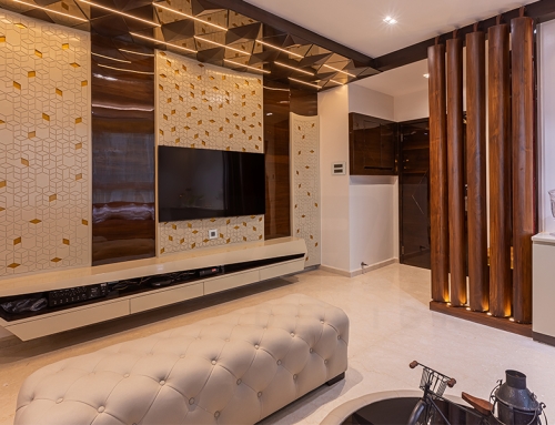
The idea behind this project was to create a continuous flow as one walked through the residence. Thereby, shaping the visual effect that each space was connected to the previous one. The client was also on a budget constraint, so this theme fit into the requirements by reducing the usage of too many different materials.
Location: Kilpauk, Chennai
Client: Mrs. and Mr. Magesh
Site area: 2000 sq. ft
Design Team: Ekta Agarwal, Parul Agarwal, Arun Kumar & Gauri
Year of Completion: 2017
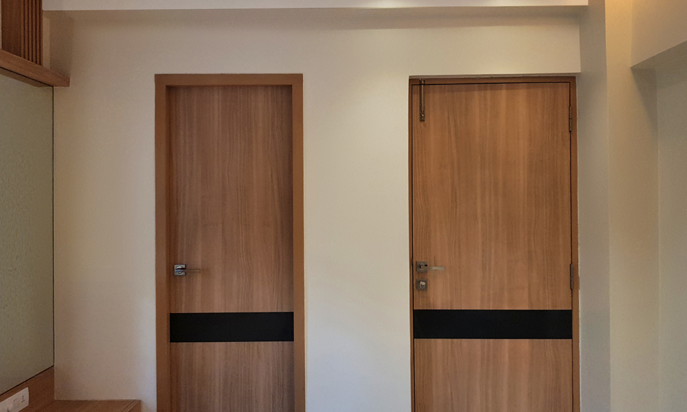
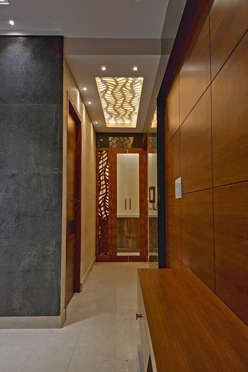
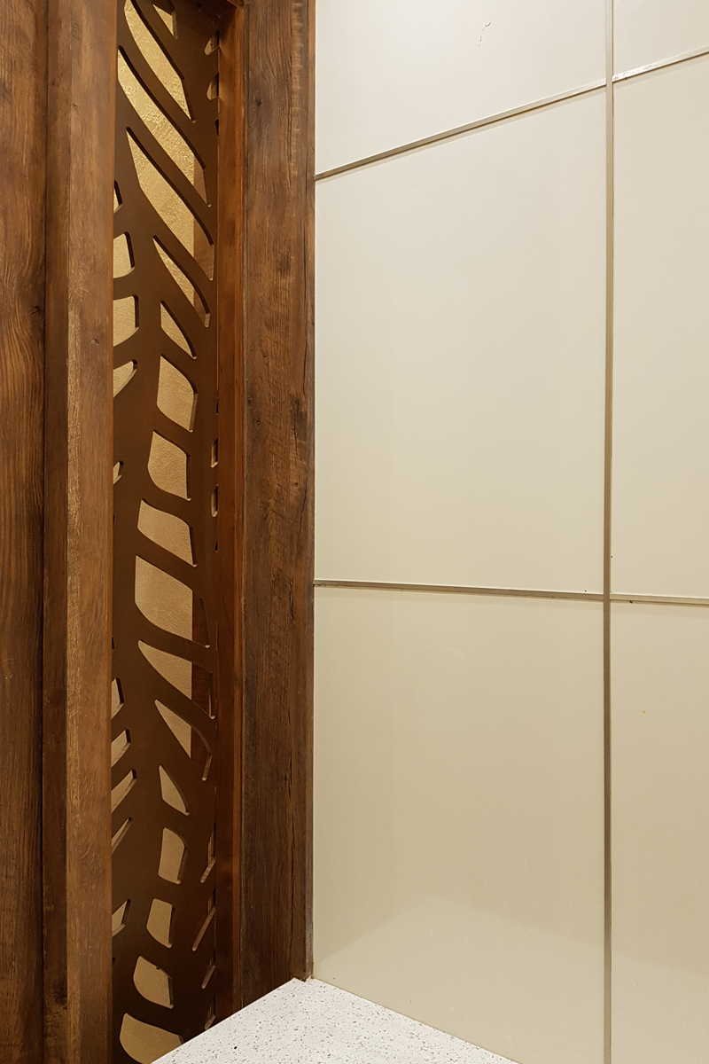
The proposed scheme showcased earthy and rustic tones in a modernized way. The built-in furniture along with the material selection for the structural elements were designed by the studio. The entrance of the space has been highlighted by using a screen in the ceiling that creates a more dynamic lighting effect. The same pattern has also been merged into the side of the of the door.
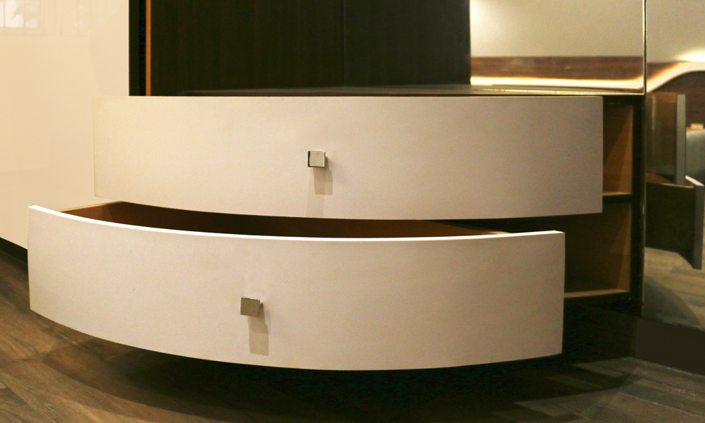
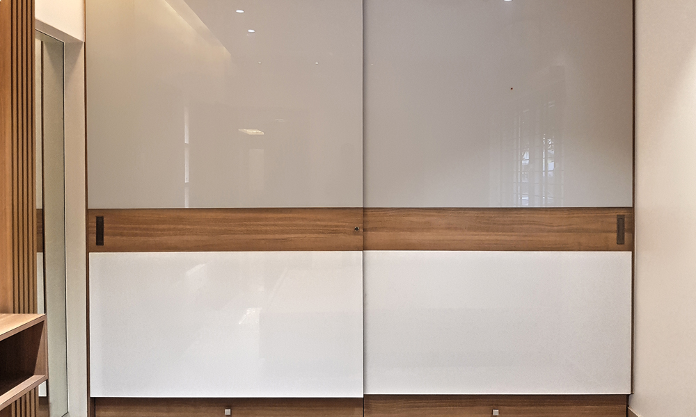
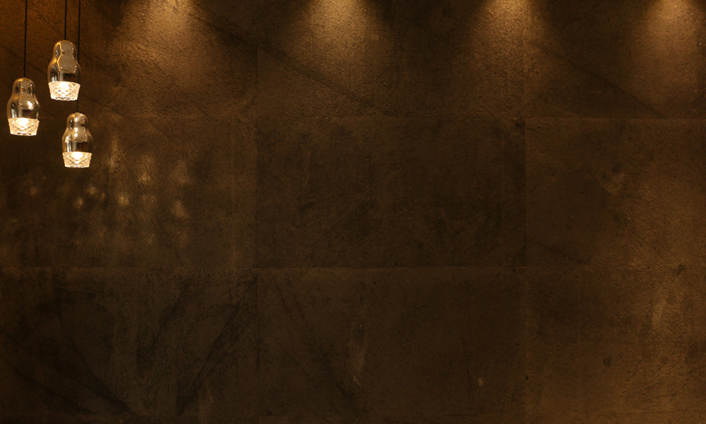
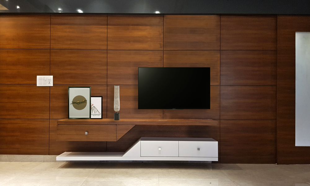
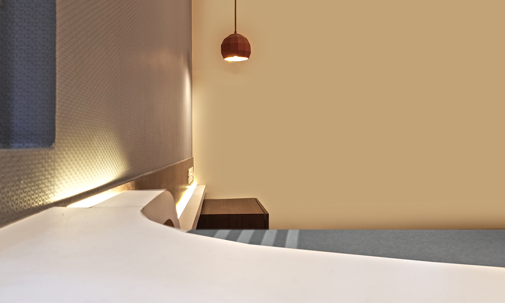
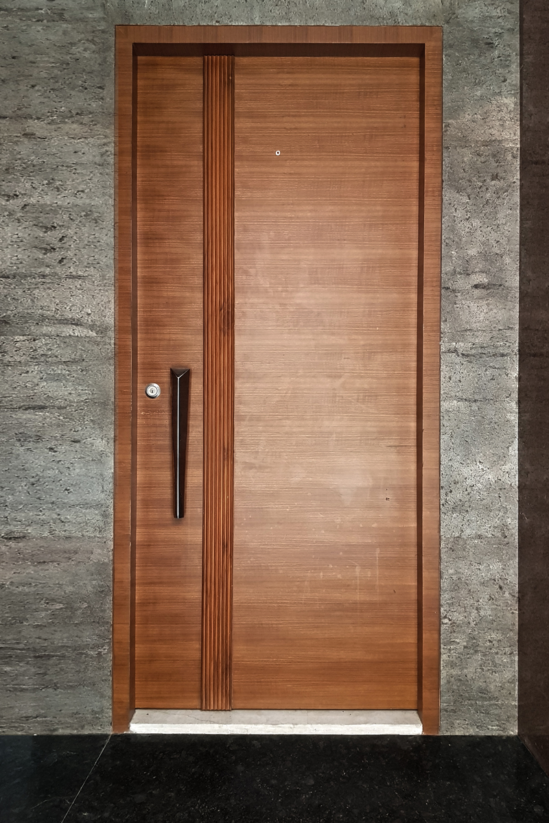
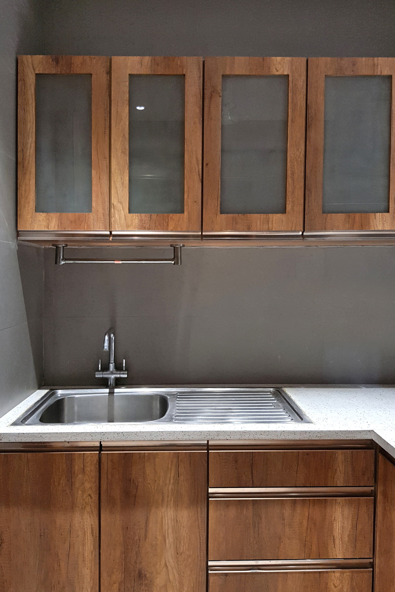
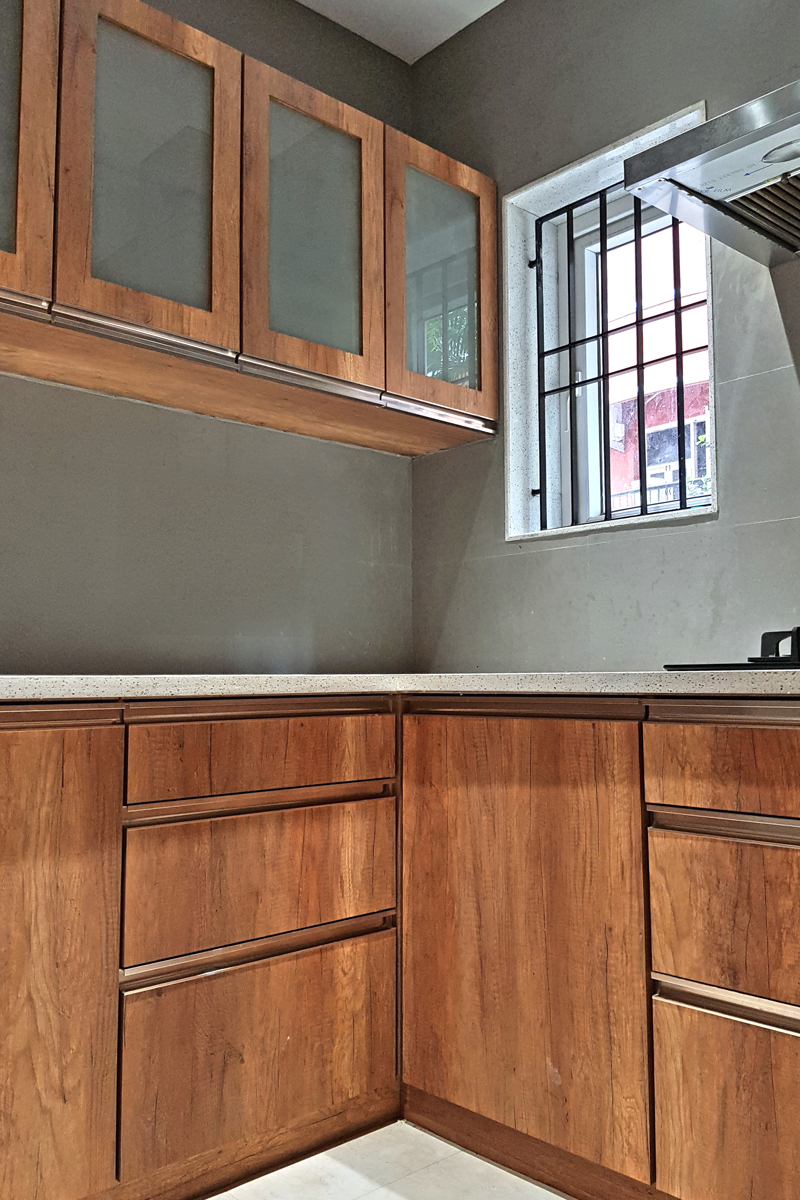
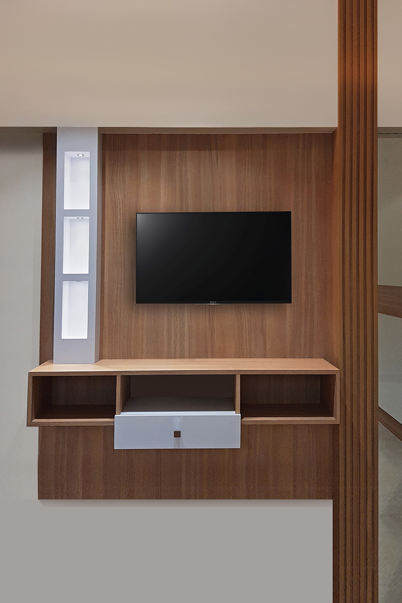
Dark and rich walnut wood cuts through the grey cemented wall. The kitchen follows the same theme with a white granite countertop to brighten up the space. Since the materials were restricted to modern earthy tones, the bedroom space was designed with variations in volumes and depth. These design features were also functionally accurate, serving as display shelves, TV consoles, storage, etc.


